


%20(1)_11zon.png)

other projects
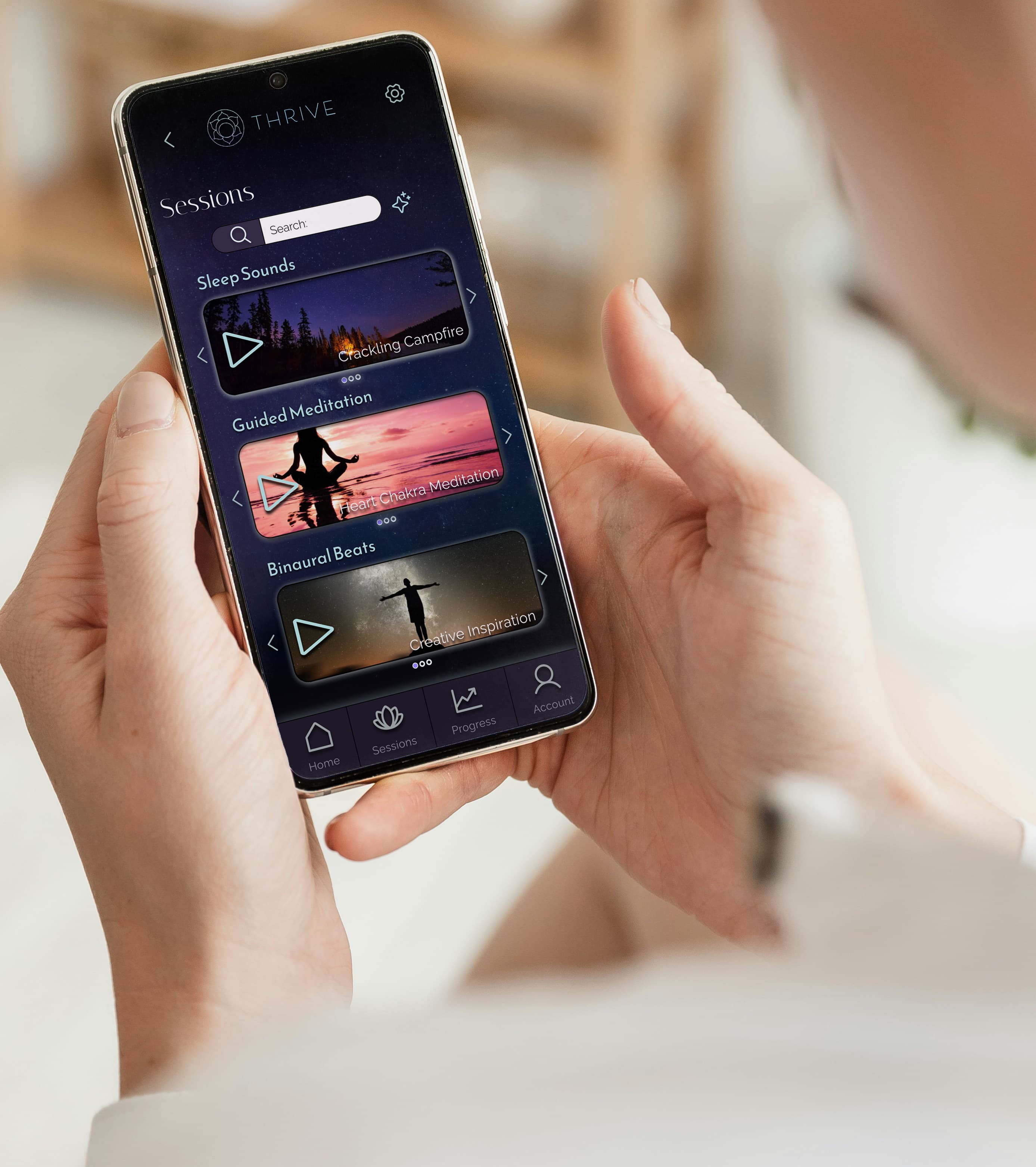
thrive
ui/ux
For the Thrive project, I focused on UX research, mapping user flows, and creating medium-fidelity wireframes to help design a user-friendly and visually clear meditation app.
dinewise
ui/ux
I redesigned the Dine Wise app to improve accessibility and usability for students seeking discounted meals.My role involved conducting user research, optimizing user flows, and developing high fidelity prototypes to deliver a seamless and effective experience.

litness
graphic design & Branding
Litness is a fitness brand where I worked on branding and marketing materials, including brochures, posters, and digital assets. I used InDesign to design and create a cohesive, impactful brand identity that resonates with the target audience.
.jpg)