Dinewise

Date

December 2024

Project Type

App Redesign

What I Do?

UX Research, App Design, Feature Integration

Dine Wise is an app built for students to make finding affordable, nearby meals simple and stress-free, so they can spend less time worrying about food and more time focusing on what matters.

Role

UX Designer

Tool

Figma

Skills

UX Research

Prototyping

Wireframe Design

The Opportunity


Before redesigning, I reviewed the original Dine Wise app and gathered informal feedback from BCIT students who fit the target audience. From these observations, two main issues stood out:

1. Lack of personalization – students couldn't plan their meals according to their dietary preferences that will fit through their lifestyle

2. Poor navigation – the previous dinewise app has a confusing navigation that led users to difficulty to get around.

While other competitors like Eatigo and Meal Mentor offered basic discounts, but none were built with students in mind. What students needed was an experience tailored to how they live, eat, and budget.

User Persona


Michael represents our target audience. He is a busy BCIT student balancing classes, a part-time job, and a tight budget. He needs a simple, affordable way to find meals that fit his dietary needs without wasting time scrolling through irrelevant offers.

My Goal


Improve the navigation and add the new feature which is the personal meal planner to help students plan meals, find deals, and navigate the app without frustration.

My Process

User Flow


Before starting wireframes, I mapped the new DineWise user flow to show how the navigation and Meal Planner fit together. It combines the core ordering steps with the Meal Planner process, letting users switch easily between finding a deal for today and planning meals for the week.

Low Fidelity Wireframes


I began by creating low-fidelity wireframes in Figma to quickly map out new navigation and the Personal Meal Planner feature. This allowed me to test layout ideas early and gather feedback before committing to visuals.

High Fidelity Wireframes


Once the layout was validated, I designed high-fidelity wireframes that incorporated the final color palette, typography, and iconography. These showcased the complete visual style and interactive flows for the redesigned app.

What I Changed and Why


The biggest shift started with rethinking navigation. I introduced a bottom nav bar with five clear sections: Home, Explore, Meal Planner, Bookmarks, and My Deals.
This gave the app structure, clarity, and a familiar flow students are used to.

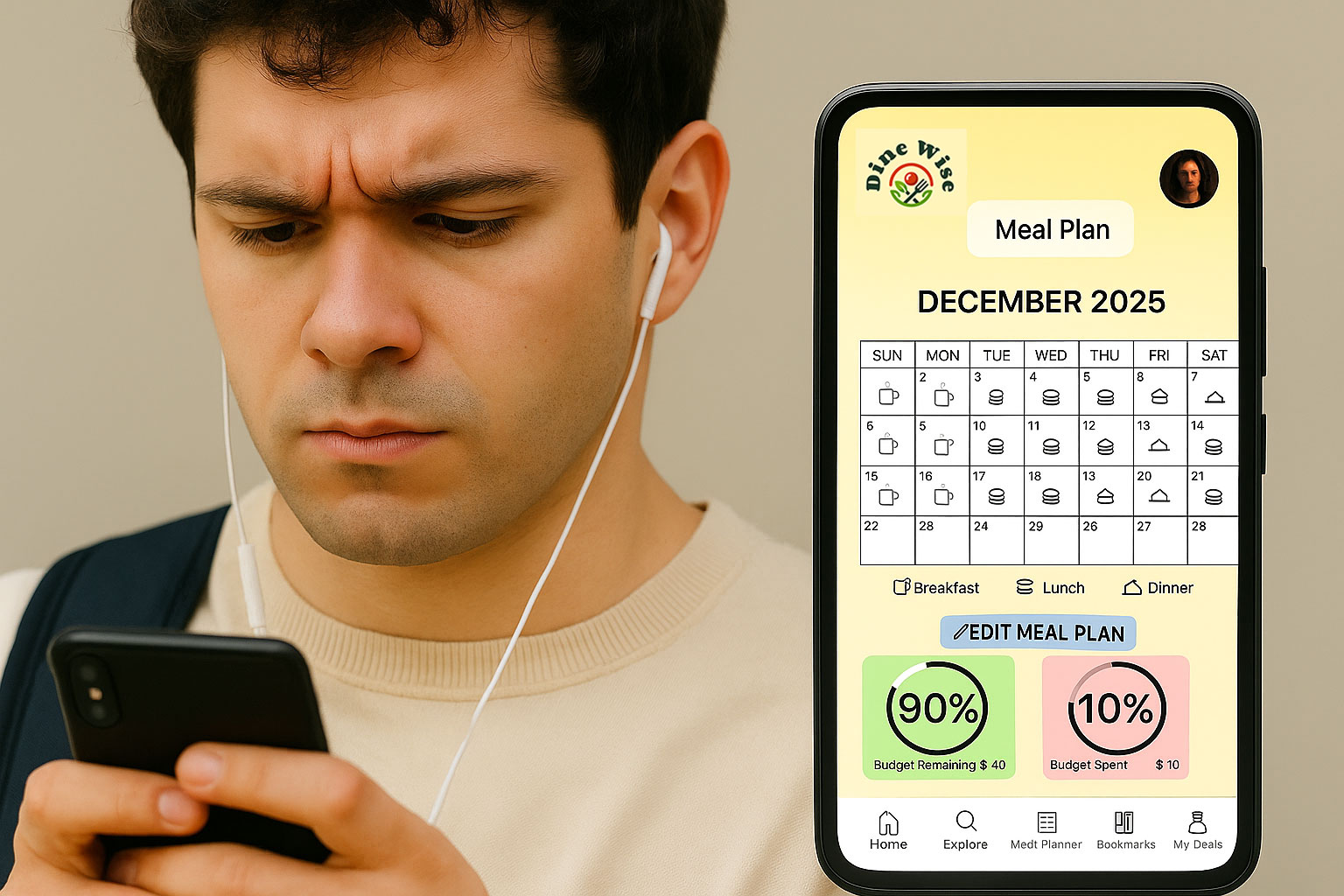
The second game-changer was the Personal Meal Planner. It lets users set dietary preferences and plan meals. Simple idea, but high impact as it turned Dine Wise from a basic discount app into students that could actually rely on every day.

Key Features

Meal Planner & Bottom Navigation


The redesigned Dine Wise app includes several standout features that make it a better fit for students. The Personal Meal Planner allows users to tailor their dining options to their dietary needs, while the deal tracking system helps them keep tabs on multiple discounts across food outlets.

A streamlined bottom navigation bar ensures quick access to essential sections, and customizable dietary filters provide personalized meal suggestions. Together, these features create a seamless and engaging experience that truly caters to the unique needs of students looking for affordable dining options.

Final Prototype

The final prototype is built around usability, clarity, and function. Students can now browse food options based on their actual needs, not just what’s nearby. It’s more than a discount app instead it’s a daily tool that helps them eat smarter and save money.

Reflection

Working on Dine Wise showed me how much clear navigation and personalization can improve usability.

I learned to focus on solving real student pain points with practical, everyday features.

If I took this further, I’d add a student verification system so users can choose their school, log in with their student email, and unlock student-only deals, making the app more secure, exclusive, and tailored to their needs.

other projects

thrive

ui/ux

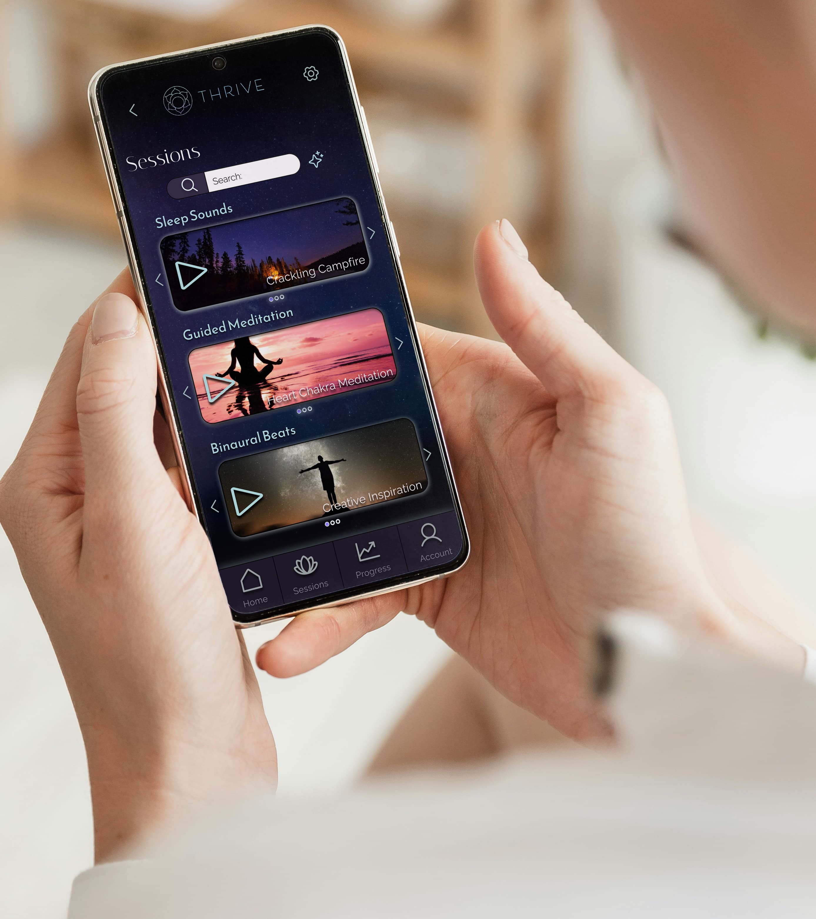
For the Thrive project, I focused on UX research, mapping user flows, and creating medium-fidelity wireframes to help design a user-friendly and visually clear meditation app.
berryyum

graphic design & Branding

For Berry Yum, a fictional strawberry yogurt company, I developed the branding from the ground up.

I designed the logo, created the color scheme, and developed promotional materials using Photoshop. Additionally, I created a box mockup in After Effects to visualize the packaging design.

Litness

graphic design & Branding

Litness is a fitness brand where I worked on branding and marketing materials, including brochures, posters, and digital assets. I used InDesign to design and create a cohesive, impactful brand identity that resonates with the target audience.

other projects

Hover To preview & Visit ⬇️

Thrive

ui/ux

For the Thrive project, I focused on UX research, mapping user flows, and creating medium-fidelity wireframes to help design a user-friendly and visually clear meditation app.

BERRYYUM

graphic design & Branding

For Berry Yum, a fictional strawberry yogurt company, I developed the branding from the ground up. I designed the logo, created the color scheme, and developed promotional materials using Photoshop. Additionally, I created a box mockup in After Effects
to visualize the packaging design.

lITNESS

graphic design & Branding

Litness is a fitness brand where I worked on branding and marketing materials, including brochures, posters, and digital assets. I used InDesign to design and create a cohesive, impactful brand identity that resonates with the target audience