


.jpg)
other projects
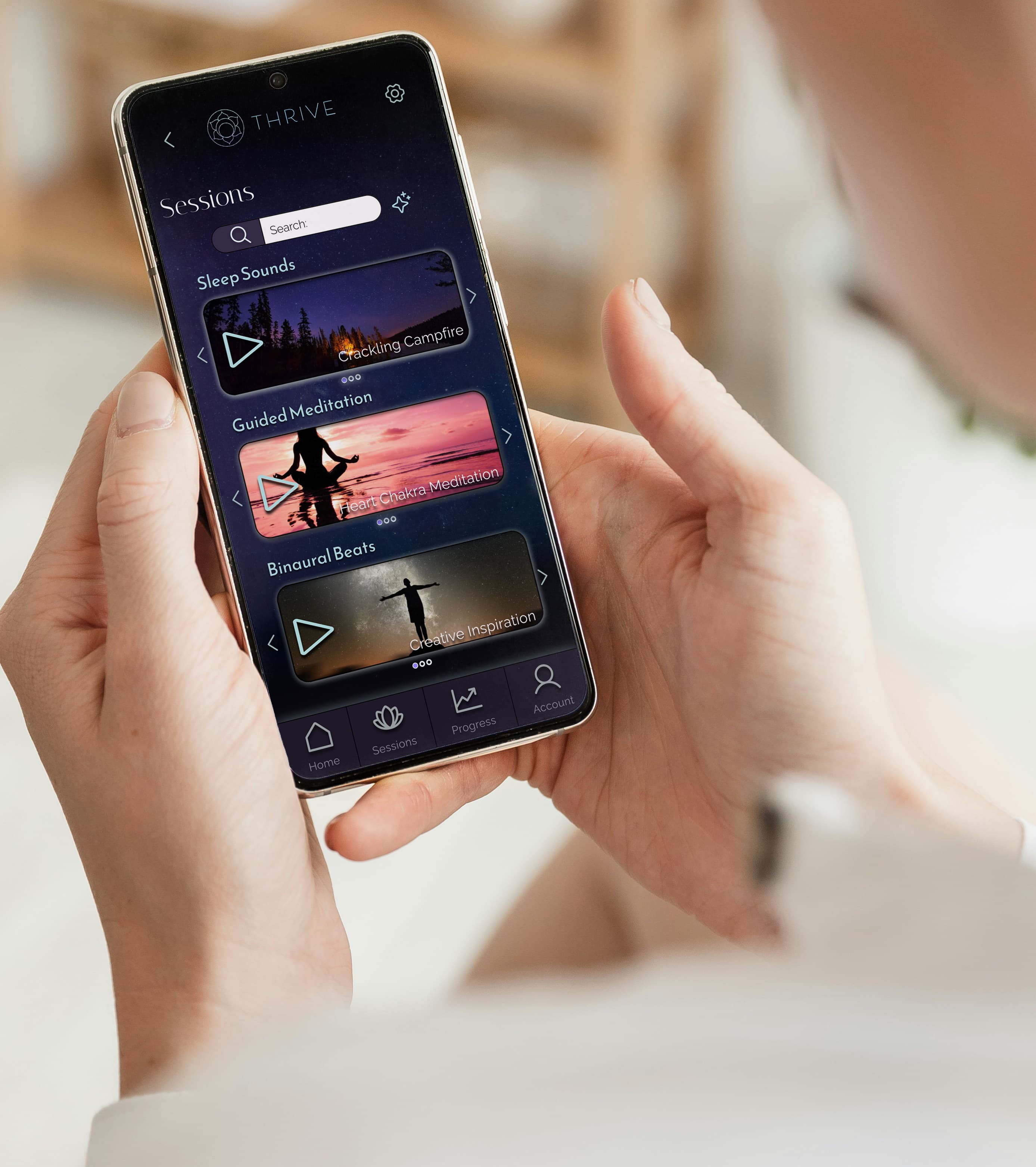
thrive
ui/ux
For the Thrive project, I focused on UX research, mapping user flows, and creating medium-fidelity wireframes to help design a user-friendly and visually clear meditation app.
dinewise
graphic design & Branding
I redesigned the Dine Wise app to improve accessibility and usability for students seeking discounted meals.My role involved conducting user research, optimizing user flows, and developing high fidelity prototypes to deliver a seamless and effective experience.

berry yum
graphic design & Branding
For Berry Yum, a fictional strawberry yogurt company, I developed the branding from the ground up.I designed the logo, created the color scheme, and developed promotional materials using Photoshop. Additionally,I created a box mockup in After Effectsto visualize the packaging design.
